Job Market analysis for the Data industry
Introduction
For this project I decided to analyse and investigate a fictitious dataset dealing with the job market in the Data & Analytics industry for the years 2016-2021.
The main goal of this project is not to draw relevant conclusions that can be applied in the "real world" since it is a fictitious dataset but to put into practice many of Tableau's core techniques.
For this "exercise" I'm going to put myself in the shoes of a freelancer helping a company of headhunters to find out about the state of the job market for Data Science related jobs and the skills that are generally in demand.
Data Analysis Process
- Data Check
- Explore Data
- Analyze Data
- Dashboarding
Communicate Insights
Techniques used
- Calculated Fields
- Filters
- Area Charts
- Bubble Charts
- Box Plots
Key Insights
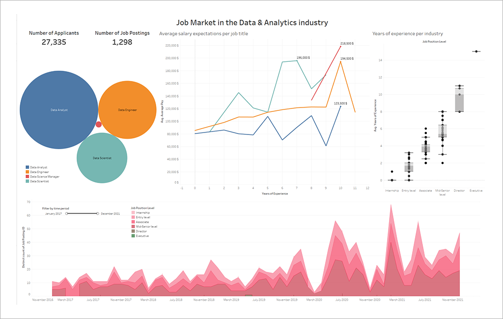
- It takes an average of 11 years of experience to become a director in the medical field, whereas it takes only 8 years in the digital industry.
- Data Analyst seems to be the most sought-after position in companies in recent years. It is also the one that pays the least well.
- There is an upward trend in the number of open positions for Data jobs.
Data Check
I start by doing a quick data check. I import the data into Tableau. I check that everything has been imported correctly and then I take some time to look at the columns and rows. I like to take my time to get to know the dataset well when I do an initial analysis. Less time will be needed for the analysis if the content of the dataset is already well-known. Following this, I check if there is a need to make changes to Data Types and Dimensions/Measures and make them if necessary.
In this case, I observe that there are quite a few null values with regard to salaries, which is quite realistic as it is relatively rare to have the salary posted directly in the job posting. To confirm this, I quickly create a Calculated Field that will count the number of Missing Values for the "Minimum Pay" Field:
IF ISNULL([Minimum Pay]) THEN 1 ELSE 0 END
Indeed, we end up with 1195 Missing Values, which is quite substantial, but I repeat it. The main goal of this project is not to draw conclusions applicable to reality. This is why I am not going to dwell more than that on the management of null values for this case.
Explore Data
It is in this and the next part that I really start to explore the data. To do this, I decided to make the following graphs:
- The most represented industries
- The experience required for each position
- The number of applications per year and position
- The most represented Job Titles among the following 5: Data Analyst, Data Engineer, Data Science Manager, Data Scientist, Machine Learning Engineer.
- The evolution of salary by Job Title and by years of experience
Analyze Data
In this part, I continue to investigate the dataset, but with more oriented questions and more advanced charts.
I’m creating a boxplot that represents the distribution of years of experience by industry and by Job Position Level. This will certainly be useful in our final dashboard.
Next, I’m focusing on a particular skill that is often asked in Job Postings (you guessed it: Tableau) and which Job Titles require this skill the most. Also related to Tableau, I’m also examining which level of experience and which Position Level require this skill the most.
Once this is done, I'm going to start creating the final dashboard and deciding which sheets to include in the dashboard. It is not necessarily useful to use all our sheets in the final Dashboard as they may not provide relevant information. For example, our few charts that cover "Tableau" may not be relevant in the final dashboard
Dashboarding
Thanks to all the graphs made earlier, I’m now able to create a Dashboard and make recommendations based on my findings. But before that, I always ask myself at least 3 questions before creating a dashboard:
- Who is my audience ? As a fictious Data Analyst consultant, my audience is recruiters and headhunters from a recruiting company. They are quite familiar with the field, therefore they’ll understand all of the previous metrics I have covered earlier.
- What do they need ? What’s their end goal ? They need to know the trends in the job market for positions in Data Science.
- How can a dashboard help them ? A dashboard is perfect to give them an overview of the market over several years. It also allows us to highlight potential insights found
So for the dashboard, taking into account the information detailed above, I decided to use the following charts:
- Postings over time
- Which Job titles are the most sought after
- Salary Analysis
- Years of Experience Analysis
I also added 2 KPIs that I created during the elaboration of the dashboard: The number of Applicants and the number of Job Postings