US Tech Layoffs
2022-2023
Introduction
The goal is to explore a dataset that covers the Tech Layoffs in the US between January 2022 and January 2023.
This dataset comes from Kaggle and has been widely shared and discussed on Twitter. So I thought it would be interesting to see what insights could be gleaned from such a dataset, especially when we see that the tech sector has fallen a lot on the stock market in recent months.
Data Analysis Process
- Data Check
- Explore Data
Analyze Data- Dashboarding
Communicate Insights
Techniques used
- Average Reference Lines
- Parameter + Filter (Top N)
- LOD expressions
- Calculated Fields + Functions (IF, COUNTD, etc.)
- Data Splits
Key Insights
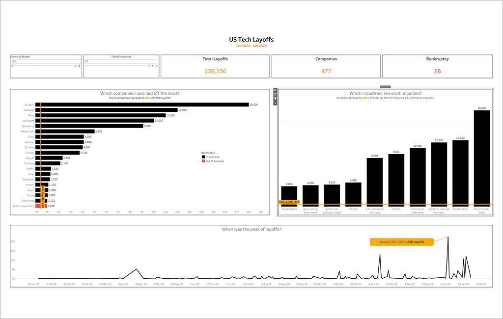
- Top 5 companies represents 44% of total layoffs !
- Amazon alone make up 13% of total layoffs and 100% of total layoffs for the entire E-commerce industry.
- 23’000 layoffs occurred on 5th January 2023 representing 32% of all 2022 cases.
Data Check
First, to be able to use the Total Layoffs column, we just have to recreate a column and remove all the strings to keep only the numbers.
Then, I have to change the column "Impacted Workforce" datatype from string to number as it is a percentage.
For some rows, we do not know the precise number of layoffs. Yet, the impacted_workforce_percentage show 100% and the source does not indicate whether this is a default value or not. For my part, I consider this to be a correct figure and use these percentages to calculate the number of companies that went bankrupt.
Explore Data
We are in the data exploration phase, the aim is not to carry out in-depth statistical analyses but simply to identify patterns and potential relationships in the data that can lead to important insights. Here are the charts I decided to build to explore this dataset:
- A line chart that displays the number of redundancies made each day.
- A dynamic bar chart that shows the companies that laid off the most during the period.
- Another bar chart that represents the most affected industries.
- A KPI that displays the number of companies that went bankrupt.
- A KPI that displays the total number of layoffs and another that shows the number of companies affected by layoffs.
Dashboarding
The dataset does not have many columns so the number of useful charts that can be made is rather small and I think I covered it pretty well with the previous charts.
Therefore, I'll simply use the charts previously made and add some features to them such as: Annotations, Reference Lines, relevant and insightful titles and subtitles.
That's it! You can see the final result at the beginning of this article or you can interact with it by clicking on the button below.